Powered by the Omega Industries Group of Companies

Choosing the Right Color Scheme for Your Dallas Workplace

color scheme for dallas workplace

Picking a color scheme for your workplace is critical to the feel and the ambiance of your entire working space. Paint can make a far bigger difference in the feel and emotion of your workplace than many people realize. If you want to consider how this can be true, think about how a red painted wall makes you feel versus a neutral white wall. You can see right away that paint can bring emotion along with it into a room.

Picking the right color scheme for your workplace is a big decision. You will want to consider the kinds of work that is being done in your business space as well as the kind of space that it is. Industrial locations will likely need different paint colors than a desk or cubicle workspace. Color schemes need to be linked to the work that you do with care.

If you are ready to learn more about choosing the right color scheme for your Dallas workplace, you need to read on!

Consider Branding When Choosing the Color Scheme for Your Dallas Business

branding color schemes for your dallas workplaceOne of the key things that you need to think about when you are picking your color scheme is your brand colors. It would not make sense to paint your business with colors that are not part of your brand colors unless you are considering a neutral palette for the interior of your business. Your brand colors will need to be incorporated at least partially in any paint job that you consider.

Branding is essential to the impression that customers get when they step into your business. You will also communicate brand loyalty within your workers by making sure that the brand message is backed up by brand colors inside the workspace. As we stated before, paint colors have emotions associated with them and your branding colors need to appear in your business as well as in your marketing materials and ads.

Think About Emotions

color schemes for your Dallas officeThe emotions behind paint colors are actually fairly standardized. Most people have the same emotions about colors, so you can count on the impression that you are making when you choose each color. This set of common emotional responses can help you to pick the perfect colors for your business.

These are the common associations that people make with colors:
· White: Clean, pure, sterile
· Orange: energy, creativity, joy
· Red: energy, power, passion
· Purple: luxury and power
· Black: darkness, mystery, elegance
· Yellow: happiness, energy, intelligence
· Green: freshness and peace
· Blue: tranquility, peace, thoughtfulness

Emotional reactions are not guided by logic and you will want to avoid color combinations that will lead to making people feel in a way that you don’t want. You should avoid combining colors that will bring energy with them that is not the kind you want to be associated with your brand. These ideas and feelings are easy to avoid if you stick with neutrals or you might choose to insert one brighter color into your overall design and branding story through your paint choices.

Who is Your Customer?

color schemes for Dallas area offices
A common misconception that business owners run into is that they need to pick paint schemes based on what is being done by other businesses around them. Each business has a different audience who is their target customer. If you are selling products to young girls, you might need to consider a color palette for your business that is bright, colorful, and cheery. If you are working in banking, you will naturally want to gravitate more toward serious colors that will appeal to older people and business owners.

The color story of your business is directly linked to the kind of work that is being done there. You will not want to pick a bright red and black paint scheme if you are selling mattresses, any more than you would want to pick a neutral and bland color palette if you are selling home goods or art of some kind. There are many different color stories that you can pick to create an impression on your customer, but you will want to be sure that you keep your target consumer in mind when you are picking from your various options.

Look to Dallas-Area Competitors When Selecting a Color Scheme

workplace color schemes for the dallas area
Your competitors might be a great guide for your business color palette in two ways. You can choose to stick to an industry standard so that your business is instantly recognized as being part of the industry that you work in, or you might choose to be entirely different from the norm to stand out from the crowd.

Each of these color palettes will create very different reactions in those who are visiting your business, and you will have to consider whether or not you want to stay in step with your industry or break the mold.

Most people associate certain paint colors with certain industries. These color associations can shift, but overall, most industries are full of businesses that are decorating and painting in the same way. It can be very risky to break from the crowd and do something that is very different from what everyone else in your market space is doing, but there can be rewards for being unique as well.

Staying in step with your competition can be a major benefit in many ways, even if you are keeping track of what they are up to so that you can do the opposite. Always remember that you need to think about the feelings that you are going to be evoking in your employees as well as your customers. Your employee-only spaces might need to be painted with a different color palette than your customer-facing spaces if you are trying to be sure that you think about productivity.

Accent Colors Can Add Personality

accent color ideas for your Dallas office
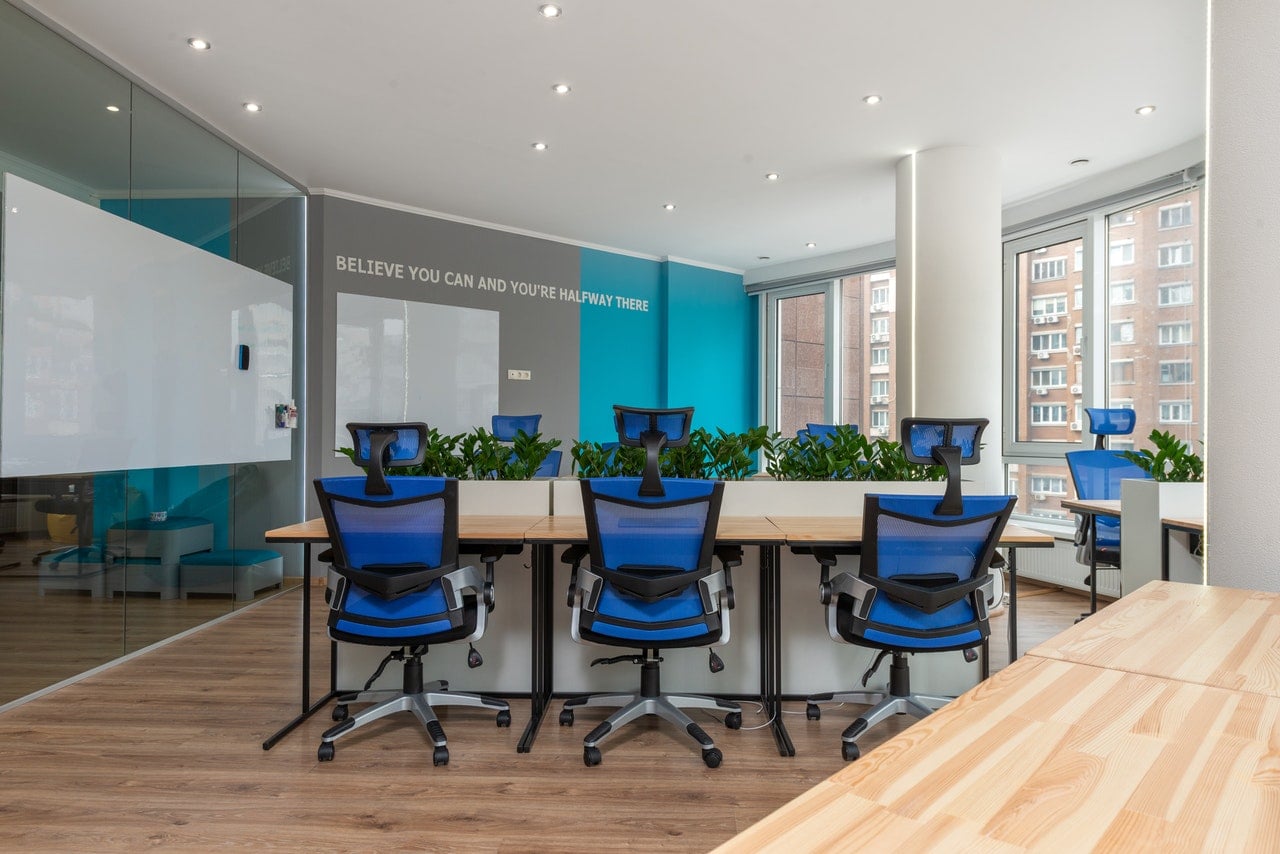
Adding an accent color can give your spaces a certain additional pop of interest that would be missing without them. If you need to use a more neutral color scheme for your business because of the kind of industry you work in, you are not stuck without any options to create a little bit of personality in your workspaces. You can easily add a single bright color to your paint scheme and bring some life into the rooms and customer-facing spaces.

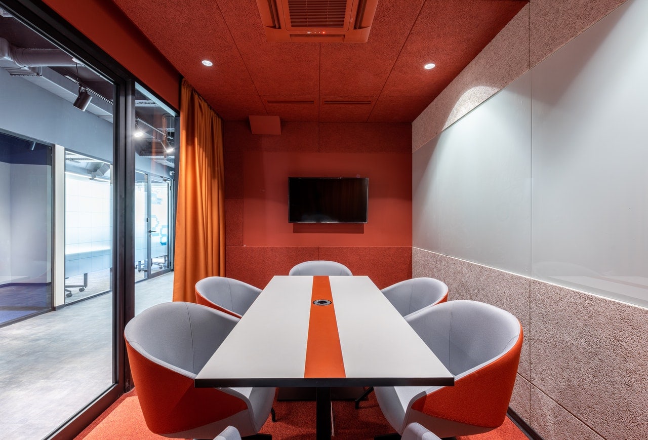
If you want to keep things neutral and safe, some blue or some green can be a really good choice for your accent color. If you want to make a more bold and aggressive statement, a brighter color like red can do wonders for your business paint scheme. There is nothing that says that you cannot add some touches of personality to your working spaces, so long as they do not distract from the overall appearance of your business or cause an emotional reaction that you do not want to bring into your business spaces.

Businesses also use these accent paints to draw customers to particular areas. If you want to display items for sale on a single wall, make sure that you consider painting this wall a different color to draw the eye. Likewise, if you need people to pick up a cart before they shop at your store, a brightly colored cart return and pickup area will automatically guide people to take the actions that you are asking them to take.

Paint can make a difference to the way that the activities inside your business flow and shift, and you will want to be sure that you do not paint spaces inside your business that you do not want to have become focal points. Creating attention in certain spaces can be a very helpful way to influence customer behavior and you should keep this in mind when you are working on your color scheme.

The Weather and Natural Light in Your Dallas Office Impact the Colors

color schemes suited for your Dallas-area workplace
Not every location gets the same light during the day or the same seasonal brightness and darkness. If you have a business in a place that gets a lot of sun each year, you can use many more colors than places that have four seasons and a lack of sun during large parts of the year. Avoiding greys, blacks, and other dark colors can be important in places that do not have a lot of sunshine each year. These colors can make your interior spaces even darker during the winter months.

Likewise, using too many harsh and bright colors inside businesses that are exposed to a lot of sun every year can cause the interior of your working location to feel overwhelming and too bright. There are definitely considerations that need to be made for the weather and the light that your unique location gets each day. People tend to forget about these factors until it is too late and the painting job is done.

If you are working in a building that does not get much natural light at any season, the colors that you work with will be very different from workspaces that get a lot of daily light. Darker colors can react very differently to spaces that have natural light. You might not get the same overall color story from the same colors when exposed to sunlight or when lit only by fluorescent overhead bulbs. The conditions around and within your workspaces can be greatly impacted by the lighting and the weather, so you will need to keep this in mind when you are picking paint colors.

Painted Text Needs the Right Background

Dallas area color schemes for your office
If you decide to add your business logo or a saying to the walls in paint, you will need to think about the contrast between the wall color and the text or the logo. You will not see a logo or a brand name clearly if it is placed over the wrong color. This can limit the impact of your branding messaging and you will want to avoid painting something on the walls that will be swallowed up by the interior colors all around it.

If your logo is white, for example, you will need to pick a background color that will contrast with it to make it stand out effectively. It is more common than you might think to see businesses pick interior colors that do not do justice to a logo that is added to the walls in customer-facing areas.

There are many reasons that you might pick a neutral color for your overall color palette, but you might need to invest in an accent wall to display a light-colored logo. This is just one example of ways that the background colors of your paint scheme might impact the effectiveness of adding your logo or other text to the walls inside or outside your business.

Add Curb Appeal to Your Dallas Business With the Right Paint Colors

dallas business color scheme ideasIf you want to make sure that your business is going to stand out and be visible, you will need to pick a paint scheme that creates a statement without being garish or too bright. The area that your business is located in can greatly impact the color choices that you will make to create this curb appeal statement. If you are located in a downtown area with lots of traditional architecture, you might not want to pick a bright pink or loud red for your exterior painting scheme.

Curb appeal involves visibility but it is also linked with the feeling or emotions that people experience when they see your business from the road. Being visible is not always about being brightly colored and you will want to balance the demands of being noticeable with being tasteful when you are thinking of curb appeal. You might be desperate to paint your building a loud red or blue, but if the buildings all around you are white or grey, you might actually be working against the curb appeal that you were looking to add to your business.

Curb appeal creates the welcoming environment that you want to offer to potential clients and you should always consider that you are trying to make customers feel safe and secure entering your building. Being too different or too off-putting from the start might make people turn around before they ever set foot inside your business. You will also want to be sure that you keep the paint fresh and clean on the exterior of your buildings so that people are not worried about the quality of the work that you can do for them.

There is a direct link in most people’s minds with the sharpness and upkeep of the property they are walking into and good quality work. A neat and tidy workplace is usually connected with an impression of professionalism and quality work. You will want to think about this when you are considering your paint scheme and the upkeep that will need to be done on certain paint colors and types to keep your buildings looking their best.

Color Schemes Can Say a Lot About Your Dallas Business

good color scheme inside the office resonates to productive employeesThe color scheme that you pick for your business can say a lot of things about it, both to employees and customers. You need to be aware that paint colors bring emotions with them and the colors that you choose for your business paint scheme can directly impact people’s feelings about your business and what it can do for them. Keeping the mood right and balancing the need to show your branding colors can be tough, but a painting professional can help you to design the perfect color scheme for your business.

There are many considerations that go into choosing a business paint scheme, and your branding message, as well as your emotional message, need to be front and center in your choice.

Choosing neutrals or loud colors might be perfect for your industry or your branding needs, and you will want to think carefully before you make a selection just based on your personal preferences. The right paint scheme for your business requires a balance of design that is easy to find if you use this guide for your paint planning needs.

No matter what color scheme you land on, finding high-quality expert-level commercial painters is key to outstanding results. We would love to help you bring new life to your workplace. Contact us today for a free quote on your next painting project!

Request a call

Get in contact to reserve a confidential site assessment with one of our experts for your commercial Texas-based location.

Get a Proposal

Let us know a bit about yourself and we'll design a plan of action for your project needs.

Your role

Thanks for contacting us!

We will get in touch with you shortly within one business day.